Hosted by That Artsy Reader Girl
I like the typography of all of these covers.

1. Extremely Loud & Incredibly Close by Jonathan Safran Foer
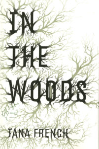
2. In the Woods by Tana French
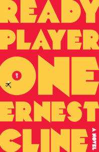
3. Ready Player One (Ready Player One, #1) by Ernest Cline

4. The Anatomical Shape of a Heart by Jenn Bennett
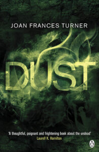
5. Dust (Dust, #1) by Joan Frances Turner

6. Oil: Anatomy of an Industry (Bazaar Book) by matthew yeomans

7. Tree of Codes by Jonathan Safran Foer
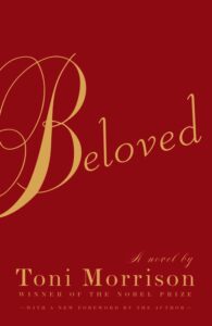
8. Beloved (Beloved Trilogy, #1) by Toni Morrison
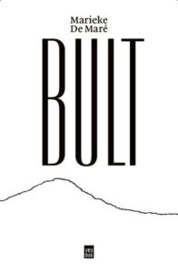
9. Bult by Marieke De Maré
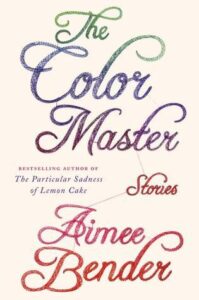
10. The Color Master: Stories by Aimee Bender
Tana’s is really cool looking and at one time I owned Jenn’s, which always stood out to me. In fact, I think I was going to add Jenn’s to my list, and then didn’t but it definitely seems like a great design and look based on the title. 🙂
Thank you!
Oil.
Wow!
I know, right?
I love the way Extremely Loud & Incredibly Close and The Anatomical Shape of a Heart fit into the shape of the design.
Agreed!
The one for In the Woods always tempts me, even though I tried a Tana French book and didn’t get along with it… I keep meaning to give her work another shot, hehe.
Honestly, I get that.
Jonathan Safran Foer’s books always have such unique typography! Very eye-catching. Also, in all the time I’ve seen the Ready Player One cover, I think this is the first time I’ve noticed the details in the “O”! Great picks 🙂
Thank you!
These are fantastic! I especially love Extremely Loud & Incredibly Close:-)
Thanks. 🙂
Lovely choices, I like the simplicity of Oil, it’s such a clear association
Thanks for sharing your #TTT
You’re welcome. Thanks for stopping by.
These are all unique covers. Each one is eye catching.
Thank you. 🙂
These are all so unique! I think Extremely Loud & Incredibly Close is my favorite though 🙂
Thank you!
Oh, these are great! I love book covers that put the title into a shape, the way that The Anatomical Shape of a Heart does.
Ditto. 🙂
These are excellent examples of beautiful or interesting typography. My favorites are Beloved and Dust.
Thank you. 🙂
I read and loved Into the Woods, but never paid attention to the cover! Great choices!
Thanks. 🙂
Wow! These are pretty unique, so hard to pick which one I would like best. Have a great week!
Thank you.
Oil is very clever. The Jonathan Safran Froer ones are also very eye catching
I’m glad you think so!
I really like the cover for In the Woods! Here is our Top Ten Tuesday. Thank you!
Thanks.
These are all so perfect!
Thank you.
These covers are all fantastic examples.
Pam @ Read! Bake! Create!
https://readbakecreate.com/the-ss-have-it-ten-titles-starting-with-s/
Aww, thanks!
I love those. Beloved has such a beautiful cover. Happy Tuesday!
Thank you.
That Oil cover is simple, but really grabs my attention. Great picks!
Thank you!
Wow, you chose some really amazing designs! Oil is just perfection, and The Anatomical Shape of A Heart is so beautiful!
Thank you.
Nice work! The Woods gets my vote for best. All were good though.
Thanks!
Wonderful choices, Lydia. I especially like In the Woods and Dust. Thanks for sharing and for visiting my blog.
You’re quite welcome!
I really like the cover of In the Woods. I need to catch up on the series. 🙂
Thanks. Good luck.
ah I like that a dusty looking dust is next to an oily looking oil! Those are some really great choices! Thanks for visiting my blog yesterday 🙂
You’re welcome. I’m glad you liked my picks.
I love the IN THE WOODS cover. The story is good, too!
Happy TTT (on a Wednesday)!
Susan
http://www.blogginboutbooks.com
Thanks. That’s good to know!