Hosted by That Artsy Reader Girl
 To be perfectly honest, I generally prefer book covers that include some sort of picture on them over the ones that have a fancy typographic font and nothing else.
Pictures, drawings, and other visual representations of what a book might about play an important role in helping me decide what to read. Will it be romantic, scary, or thought-provoking? Should I have my box of tissues on standby? There’s so much you can tell from what is and isn’t included in this sort of cover.
As pretty as an individual font may be, it can never convey as much information about what to expect from a story in my experience.
I’m sure there are a lot of people out there who love typographic covers, though, so I look forward to reading your posts and/or comments about why you prefer them to other types of covers.
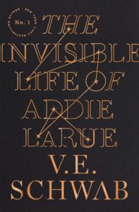
1. The Invisible Life of Addie LaRue by V.E. Schwab
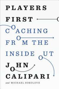
2. Players First: Coaching from the Inside Out by John Calipari
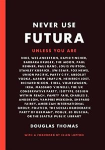
3. Never Use Futura by Douglas Thomas
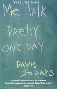
4. Me Talk Pretty One Day by David Sedaris
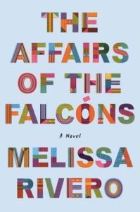
5. The Affairs of the Falcóns by Melissa Rivero
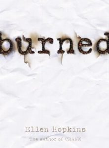
6.Burned (Burned, #1) by Ellen Hopkins
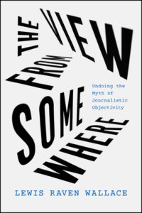
7. The View from Somewhere: Undoing the Myth of Journalistic Objectivity by Lewis Raven Wallace
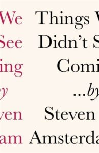
8. Things We Didn’t See Coming by Steven Amsterdam
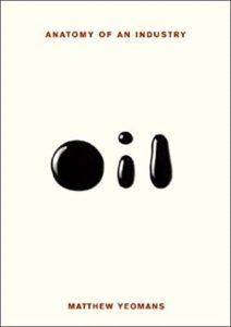
9. Oil: Anatomy of an Industry by Matthew Yeomans
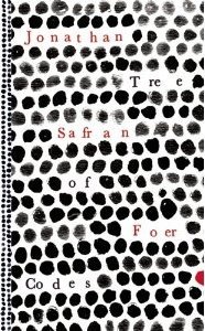
10. Tree of Codes by Jonathan Safran Foer
I would say I am in the other camp, a person who loves typographic book covers, prefers them. A designer who can use the words of a title in a clever way is a delight to me.
How interesting!
Great list of nice typographic covers. You did a great job despite preferring covers with some kind of pictures. And we have The Invisible Life of Addie LaRue in common this week.
Here is my TTT: https://herseriallife.com/top-10-books-with-typographic-covers/
Have a great week 🙂
Thank you, and that’s cool.
I also like a pretty cover, but I was amazed to see just how many books I have that has no pictures, but only words.
The Invisible Life of Addie LaRue is one of my favorites. If you had to put a picture on, what would you have used?
Elza Reads
Ooh, that’s a good question. I’m honestly not sure.
I always notice the fonts and typography on covers. Some are eye catching and some don’t capture my interest. Burned is one that is so striking and memorable.
Cool! Glad to hear it.
Fab covers! I normally prefer a cover with a picture as well, but sometimes type just works!
Yes, for sure. 🙂 Thanks.
I love that burned cover. So simple, yet so eye catching.
Thanks. 🙂
All of those get the message across.
🙂
I also used Addie LaRue in my list this week. I generally prefer covers with pictures on them as well, but I am intrigued when cover artists do something new and unexpected with the typography on a cover (with or without a picture included also).
My TTT: https://bookwyrmknits.com/2022/09/27/top-ten-tuesday-typographic-book-covers/
Yeah, that was a great pick! It’s so eye catching. 🙂
Some excellent choices here, and how could I have forgotten Addie Larue? 😀
Thank you. 🙂
I do love typographic covers that are done well. Like the one for Oil, or the coaching one. They aren’t always super easy to read, but they feel like a clever puzzle or little surprise to me! I get tired of all the samey designed covers I’ve seen. There are only so many fantasy novels with a thorn/vine border around a castle I can keep separate!
I had CRANK by Ellen Hopkins in my list this week but had to trim it down so took it out! Her books are great for this prompt. 🙂
I hear you there.
It’s cool that Crank was on your list originally. 🙂
These are unusual and very eye-catching covers! My favorite is Me Talk Pretty One Day
Thank you. 🙂
I’ve never heard of Never Use Futura, but I really like the way the lettering looks on that cover.
Glad to hear it. Isn’t it pretty? 🙂
Despite your preference for pictures, you found a wide variety of interesting covers for your list, Lydia. Good job!
Aww, thanks!
Excellent selection! The cover for Never Use Futura kind of hurts my eyes. Does that mean I’m getting old? LOL
My list went a little sideways, but I still think it’s a fun one.
Happy Tuesday!
Heh, it is a busy pattern for sure.
Your list was fun this week, too!
You have a great selection this week! I do love the cover for Addie LaRue. I also really love covers with pictures, but I’m always in awe when a designer can convey the vibe of a book with just the font and colors.
Thank you. Yeah, that’s impressive when it happens for sure!
I admire the creativity for some of these covers with typographical elements. But I also like a good cover illustration myself.
Cool! I’m glad you get it.
My favorite covers are ones that combine beautiful typography and images together, but I do like the typography to be front and center and well chosen for the book like Violetta by Isabel Allende or the new Kate Atkinson book Shrines of Gaiety. But I do like the starkness (almost shock) of an all typographic cover at times. I think it works better for some books than others though.
For sure! Your perspective makes a lot of sense.
What GREAT choices!! I did last week’s topic.
Thank you!
Great choices. I love the simplicity of burned, very effective! Have a great week!
Thanks. You, too!
I really like the colors on The Affairs of the Falcons cover.
They’re amazing. 🙂
I’ve not read Addie LaRue, but it’s one of my favourite unread book covers–I love the constellations hidden in the font. Great list!
It’s gorgeous. And thanks.
Wow. I think you win the prize for finding the best typographical covers this week! They’re all so great. 😀
That’s so kind. Thank you. 🙂
I agree with you, I definitely prefer covers with some kind of picture instead of just words.
Cool!
I prefer covers with pictures too. You’ve got some great ones here though. I especially like Me Talk Pretty One Day.
Thanks!
Interesting covers. I agree with you, I also like a picture on the cover, especially a really detailed illustration.
Have a great week!
Emily @ Budget Tales Book Blog
Thank you. Detailed illustrations are the best.
Awesome choices Lydia! I prefer covers with pictures on them too! I usually can’t resist a pretty cover!🤦♀️📚🤗💜
Thank you. Pretty covers are the best.
BURNED is a great one for this list! Love that effect!
Thank you!
This is a great list – these covers are all so striking!
Thank you!
I totally agree (as you could probably tell from my own post where a lot of my covers still had some kind of illustration on them), I like illustrated covers much better, I think they give you a much better indicator of what the book’s about! Having said that, you have picked some really striking covers.
Yes, I sure can. 🙂
And thank you!
You found some fantastic covers there, Lydia. I especially liked Players First (although I’m not into ball games but thsi is a brilliant idea), burned, The View from Somewhere, Things We Didn’t See Coming and Oil because they all show pictures with their words.
Thanks for visiting my TTT this week.
Thank you very much, and you’re welcome!
I’m the same way. I like an evocative cover that tells me something about the story. This topic has made me wonder why typographic covers are chosen over ones with pictures. Is it because the story is too hard to illustrate? I’m really curious now about how covers are created!
Happy TTT (on a Wednesday)!
Susan
http://www.blogginboutbooks.com
That’s such a good question. I have no idea how the cover selection process takes place. It would be so cool to learn about that.
I like when the font choices work with the title, like with Burned or Coaching from the Inside Out.
That’s so cool! You’ve got a lot of great ones for this week’s prompt 🙂
Thank you very much.
I tend to like imagery or photos on cover designs, but sometimes text is just as pretty or eye catching. 🙂 V.E. Schwab’s cover is a GREAT addition for this topic. Thanks so much for visiting my website this week.
You’re welcome. And, yeah, Schwab’s cover is gorgeous.
I think you have a wonderful list. I totally meant to add Addie and forgot!! lol
Aww, thanks!
oh wow, these are great! You have the best list I have seen for this meme, with original books. Oil is so so cool
Thank you very much!
These are really clever! Not just plain type but doing something with it that has to do with the book, I love that.
Thanks. 🙂
I love all these book covers, but especially the multicolored pattern for The Affairs Of The Falcons title!
I’m so glad!
I’m usually a fan of illustrated covers or some other element on the cover aside from the title alone but I love when typographic covers kind of play into the title too. Just like the ones you’ve chosen here! They’re all fantastic 😃
Thank you very much!
Typographic covers are an idea that can be overdone, but when they’re well suited to the subject they’re nice.
Personally I like bare, plain book covers that don’t invite tiresome people to demand that you stop reading and give them an instant review of a book you’ve not even had time to read yet. Tiresome people may do that when you’re reading a book with one of those old public library wallpaper-sample covers, but they’re much more likely to do it when they see colorful images, especially faces.
🙂